A logo redesign should fix use problems without wiping out brand recognition. If your logo gets hard to read at 16px, looks off across channels, or no longer fits your business, I’d treat the work like a business project – not just a design task.
Here’s the short version: I’d audit every file and use case, define whether the job is a small update or a full redo, check competitor patterns, get team input early, test a few concepts in actual use, prep the right file set, update brand rules, and roll the new logo out in phases. That approach helps cut down risk, cost, and brand confusion.
A few points stand out fast:
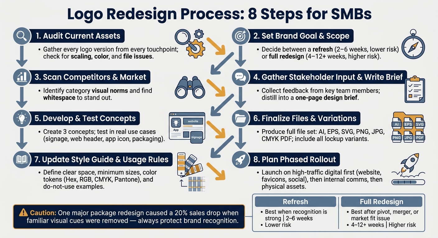
Logo Redesign Process: 8 Steps for SMBs
| Option | Best When | Time Range | Risk Level |
|---|---|---|---|
| Refresh | The logo is known but looks dated or works poorly in small spaces | 2–6 weeks | Lower |
| Full redesign | The business changed, merged, or the mark blends in too much | 4–12+ weeks | Higher |
If I were running this for an SMB, I’d focus on one simple goal: keep what people know, fix what gets in the way.
Before you touch the design, gather every version of the logo from every place it appears. That includes website headers, favicons, social media avatars, email signatures, ad creative, presentation decks, signage, business cards, uniforms, and packaging. The point is simple: see how the logo works in the wild, not just in the master file.
A basic spreadsheet is enough to keep this organized. List each touchpoint, note the problem, and mark urgency as Healthy, Watch, or Action Needed. Look for common issues like stretched proportions, recolored versions, low-resolution files used in print, and missing vector source files such as AI, EPS, or SVG. If all you have are raster files, fix that vector file gap first.
Two fast checks can tell you a lot:
Also check color consistency across RGB and CMYK versions.
These findings help you sort out one big question: does the logo need a refresh, or does it need a full redesign?
Next, line up the audit with the business goal. A logo that feels dated but still has recognition calls for one kind of fix. A logo that blends into a sea of competitors calls for another. That call should come from the business need, not personal taste. Use the audit to set the redesign scope.
Start with a few direct questions. What does the business do in one sentence? Who is the brand’s best-fit customer right now? Where does the logo show up most, and does it hold up there? Which three adjectives fit the brand, and which three do not? Those answers give the project guardrails and keep choices tied to strategy instead of opinion.
From there, decide between a refresh and a full redesign. A refresh updates what already works. That might mean sharpening shapes, updating type, or making the logo easier to read on screens, while keeping the main mark in place. A full redesign starts over and is usually the right move for businesses that have pivoted, merged, or have a mark that barely registers in the market.
| Logo Refresh | Full Redesign | |
|---|---|---|
| Scope | Modernize shapes, type, or colors while keeping core recognition | New concept and complete visual identity from scratch |
| Timeline | 2–6 weeks | 4–12 weeks or more |
| Brand Risk | Low; protects existing equity | High; can alienate customers |
| Best Fit | Strong recognition, dated execution | Pivoted, merged, or trademark-conflicted brand |
Use a refresh when recognition is strong and the main problem is execution. Use a full redesign only when the business has changed or the current mark no longer works in the market.
With the scope set, shift from internal review to outside research. At this point, you want a clear read on the market so you know what to avoid and where you can stand apart.
Start with direct competitors. Look for the category norm: the colors, symbols, and fonts that show up again and again and shape your industry’s visual default. Then look at adjacent industries for cues that may be useful. After that, study strong logos outside your category that show long-term design done well. That helps reset your bar for what good looks like.
AI has made generic minimalist marks much easier to produce, so standing out matters more than ever. Our branding and design services can help you navigate this competitive landscape.
Once you spot the common patterns, pull in internal input and turn it into a brief. If your logo still blends into the category default at thumbnail size, you’re too close to competitors.
Internal disagreement is one of the main reasons logo projects drag on. The fix is simple: collect input before design starts, then boil it down into a one-page brief.
Get feedback from owners, department leads, sales, and customer-facing staff. And don’t just ask what the brand is. Ask what it should not feel like. Having people name three adjectives the brand should never suggest – "not clinical", "not corporate", "not trendy" – often sharpens the direction faster than positive descriptors alone.
Keep the brief to one page and cover these five items:
| Brief Section | Question to Answer |
|---|---|
| The Business | What does the business do in one sentence? |
| The Audience | Who is your single best customer? Describe a real person. |
| Competitors | Which three logos should the new design actively avoid? |
| Application | Where will the logo appear most? Rank the top three surfaces. |
| The Feeling | Pick 3 adjectives it is and 3 it is not. |
Once the brief is signed off, use it as the filter for every design decision that follows. If a concept doesn’t answer the brief, it doesn’t move forward – even if someone on the team likes it.
With the brief approved, move into concept work and testing.
Develop three concepts, then judge them in actual use – not on a blank screen. A logo can look sharp in isolation and still fall apart on a truck wrap, vanish in a website header, or lose clarity as a mobile app icon.
Test each concept on the surfaces that matter most, such as signage, a website header, packaging, or an app icon. Review each one in full color, one color, and reversed versions.
When you present options to stakeholders, explain the idea behind each concept in plain English before you show the visual. That keeps the discussion centered on strategy instead of personal taste. It also helps avoid endless back-and-forth over color or font weight.
The final direction should be chosen based on scalability, flexibility, and distinctiveness – in plain terms, whether the mark feels like something only your brand could own, or whether it could just as easily belong to a competitor.
Once the winning concept gets the green light, it’s time to shift from design into production. At this stage, you’re building the full file set for every touchpoint you mapped in Step 1.
Your package should include vector files like AI, EPS, and SVG, along with PNG and JPG exports and high-resolution CMYK PDFs for print. For web use, optimized SVGs are a smart pick because they stay sharp at any size and load fast.
You’ll also need the right logo variants for different layouts and size limits:
| Variant | Primary Use Case |
|---|---|
| Primary Lockup | Main brand touchpoints (website header, signage) |
| Horizontal Lockup | Narrow spaces (email signatures, website navigation bars) |
| Vertical/Stacked | Square or vertical spaces (social media profiles, business cards) |
| Icon Only | Smallest scales (favicons, app icons, social avatars) |
| Wordmark Only | Contexts where the symbol is redundant or too small to read |
| Monochrome | Single-color applications (embroidery, stamps, black-and-white print) |
| Reversed | High-contrast needs (placement on dark or busy backgrounds) |
For favicons, export 16×16, 32×32, 180×180, and 512×512 pixel versions.
With the approved files from Step 6 in hand, lock down the rules that keep the new logo consistent. If you skip this part, teams and vendors will start making off-brand versions almost right away.
Your updated style guide should define clear space – the buffer around the logo that needs to stay free of other elements – and minimum size, which is the point where the full lockup stops being easy to read and should switch to the mark-only version. It should also list color tokens with exact Hex, RGB, CMYK, and Pantone values.
From there, spell out approved typography pairings, background rules, and do-not-use examples across the touchpoints from your audit. That includes common mistakes like stretching the mark, changing the colors, or dropping it onto a background that fights with it.
The handoff package should also include a signed ownership transfer and font licenses.
Once the files and rules are set, roll out the new identity in the same order customers see it. A phased launch helps control cost and keeps the brand looking aligned.
Start with the highest-traffic digital touchpoints from your audit, such as the website header, favicons, social media profiles, and email signatures. Then move into internal communications, press kits, and a launch announcement that makes the message clear: the brand hasn’t changed, it’s just easier to read and use.
After that, update paid ad creative, sales decks, and email templates. Leave physical assets – signage, uniforms, packaging, and vehicle wraps – for the last phase. If packaging is involved, time the switch around existing inventory running out so you don’t create waste.
In short, launch first where people see the logo most, then work your way into physical materials.
On the technical side, update the organization schema with the new logo URL and add 301 redirects for any old brand asset URLs so SEO stays protected. Set approval checkpoints for each phase, brief staff before the public launch, and if the change stretches across several weeks, run a short transition period where both logos appear so recognition stays steady during the switch.
This phased rollout helps protect recognition while making the identity easier to use.
A logo redesign needs to be handled like a business process, not just a design project. That kind of structure helps keep the work tied to the brand people already know instead of letting it drift.
The Tropicana packaging change is a clear warning. After the brand replaced its iconic "orange with a straw" image with a generic glass of juice, sales dropped 20%. When familiar visual cues disappear, recognition can fall fast. That’s exactly why the audit and testing steps matter.
For SMBs, a redesign pays off when it lowers launch risk, makes the logo easier to use across channels, and helps people recognize the brand more easily.
If your SMB needs help turning that process into a practical rollout, Blue Aspen Marketing can help with logo audits, file production, and rollout planning.
Start with a brand audit, not gut instinct. A refresh makes sense when your brand still has strength, but the visuals need an update for scale, a more current look, or better performance across digital channels.
A full redesign usually makes more sense when your business model, audience, or brand strategy has shifted. Common red flags include a cluttered logo, weak performance at small sizes, or a clear mismatch between your current brand and the values or marketing you put out today.
A professional logo redesign can cost a little or a lot. It mostly depends on the scope of the work and the skill level of the designer or agency you hire. For many SMBs, the typical range is $500 to $5,000.
But the logo fee is only part of the picture. You’ll also want to budget for the rollout across your brand touchpoints, like your website, social profiles, business cards, and other marketing materials.
Put evolution before reinvention. Update the parts that make your brand stand out, but keep the features people already know. That way, your identity feels current without feeling like a different company overnight. A simple check helps here: compare the new design side by side with your current logo and ask whether it still feels familiar at a glance.
At launch, explain the change with a clear brand story. Show before-and-after comparisons so people can see what changed and what stayed the same. Then roll out the update in phases across your channels, so the message stays steady everywhere your audience sees it.


 Physical Therapy
 MedSpa
 Dental
 HVAC
HVAC Roofing
 Pest Control
 Cleaning Services
 Landscaping
 Hotel
Hotel Cruise
 Branding
 Content Marketing
 Email Marketing
 Graphic Design
 PPC (Online Ads)
 SEO (Search Engine Optimization)
 Website Design and Development
 Pest Control